We recently launched our national brand Suncrest® in parallel with the local brand of our first certified grower — Pescadero Growers™ — for the San Francisco Bay Area market. Jim Day, the founder and CEO of Suncrest, has a rich background in this area — he was formerly CEO of The Day Group, a Silicon Valley branding and marketing company. It’s been a fun project to develop the corporate branding and associated design language for the brands of our business partners, so in this post we’ll discuss how we arrived at our new branding architecture.
We call the local Pescadero Growers brand a derivative brand of Suncrest. The logo mark behind the Pescadero Growers name is similar, but not the same as Suncrest’s logo mark. As Suncrest expands from one local community to another, the Suncrest brand and the logo mark of the local grower are the same, but the name of the local grower changes to identify their produce as local within each local market.
The mark shows off a rising sunburst from behind a tunnel-style greenhouse. The upward feeling is bright, light, fresh and in-synch with the Suncrest name.
This derivative mark is unique and yet at first look feels like a slice of the Suncrest mark. As we build a family of growers, we want each to be connected to Suncrest visually, while maintaining their own distinct brand.
Typically, singular brand identities are developed and launched to establish recognition for a product distributed nationally. But in this case, Suncrest has a dual branding challenge. First is to create a national brand to identify the consistent premium quality of lettuce grown using Suncrest’s proprietary hydroponic technology. And second is to establish a recognizable local brand that fulfills the market demand for locally grown produce.
By tying these two brand identities together, Suncrest is building a national brand, similar to a franchise, but while calling out the power and importance of decentralized growing facilities for the local markets.
The trick is to tie these two brands together, while allowing the name of the local brand to change for each local market. The rest is branding 101: develop simple, yet strong and memorable marks that are eye-catching, along with compelling and engaging graphic design and messaging.
In this case, the messaging came first. Always local. Always fresh.® was written to capture the dedication the company would maintain in serving each local market. And by doing so, being able to provide the freshest produce possible without having the cost or carbon footprint of long-haul shipping. This local product positioning statement became fundamental to all our packaging design efforts.
Designing two logos on the crisper label was a real challenge. After several iterations,
it became clear that the Suncrest logo worked well in reverse on the black to create a
foundation of support for the local grower’s logo that is more prominent on top. Adding
the ring of copy became both a design element as well as information for the consumer.
Meanwhile, at a more corporate level, it was important internally and for investors to understand the mission of Suncrest and the purpose of using hydroponic technologies in controlled growing environments. Changing the way the world grows food.® not only says what Suncrest is all about, but does it in a bold and challenging way that differentiates the company from the way agriculture has been done for centuries.
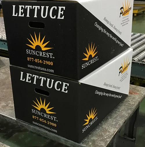
Again, both logos needed to share the space, but we also wanted to identify the box from a distance. We started with a study of shapes and colors and came up with the triangular black & white which is easily identifiable from a distance and continues the label’s black and white theme.
Graphically, there was tremendous design time spent on developing the logo marks. We wanted the mark to feel like sunshine to grow plants and to feel contemporary, simple and symbolic. It had to stand on its own as a mark, work well reversed, and in B&W as well as color. Pantone 123 was selected as the primary logo color to highlight the uplifting points of the logo graphic. Made up of both yellow (88%) and magenta (22%), the feeling of the color is indeed bright, warm and inviting. Not unlike the feeling one gets when in the greenhouse or walking in the fields on a sunny day, watching the plants grow.
Besides the label design for lettuce crisper and the shipping box design, in-store merchandising has been very important to establish the brand with the local community. Merchandising signage in the grocery store, along with restaurants including the Suncrest brand name on their menus, have been instrumental in building a very loyal following of Suncrest lettuce-loving customers.
For the licensee, the fact that they are getting strong recognition for their efforts and quality product is very rewarding, and their local brand has helped to increase their visibility and perceived value in the community. In addition, being connected to a larger family of local growers that are recognized under a broader national brand brings tremendous credibility to them as growers.
Designed for lettuce displays at the grocery store, the merchandising signage shows off the lettuce crisper with the label — this is what the consumer sees on the shelf. With this piece, the graphical style of the Suncrest® brand begins to take shape.


